Introduction
The previous OSPRI website did its best to showcase important elements like NAIT and TB Free, alongside vital corporate information such as About OSPRI, News, Careers, Events, Publications, and Resources. However, it felt a bit disconnected, with content separated into organizational details and product specifics. Understanding the importance of a unified approach, OSPRI embarked on a journey to revitalize its communication strategy.
The goal is to transform the website into a cohesive OSPRI experience, with a renewed focus on the needs of its audience. By embracing an 'outside-in' perspective and prioritizing user-centered design, OSPRI aims to create a seamless and empathic experience for all who visit the site.
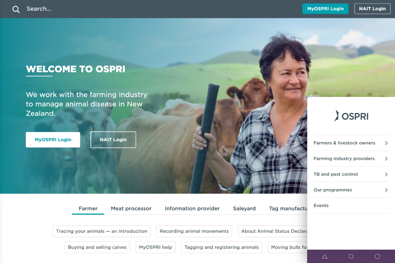
Clean and organised digital experience
The refined brand elements ensure consistency and clarity, while the streamlined information architecture enhances navigation and accessibility.
Coupled with a professional UX overhaul, the website now offers an intuitive and user-friendly interface, elevating the overall experience for visitors.

Digital brand
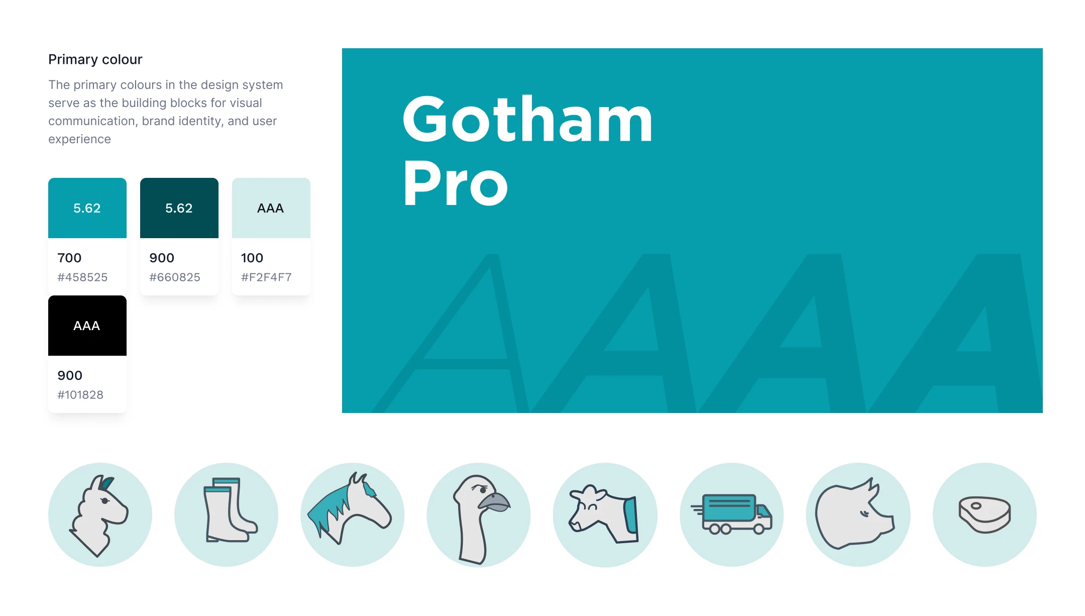
We developed a digital style rooted in simplicity and authenticity, reflecting the hardworking individuals it serves. Whether it’s the MyOSPRI product, the core website, or marketing materials, every element is designed to resonate with farmers in a friendly and calming way.
With a focus on clarity and genuine connection, the visual and textual elements are crafted to support and empower the farming community, ensuring that OSPRI communications are both effective and approachable.
Digital product
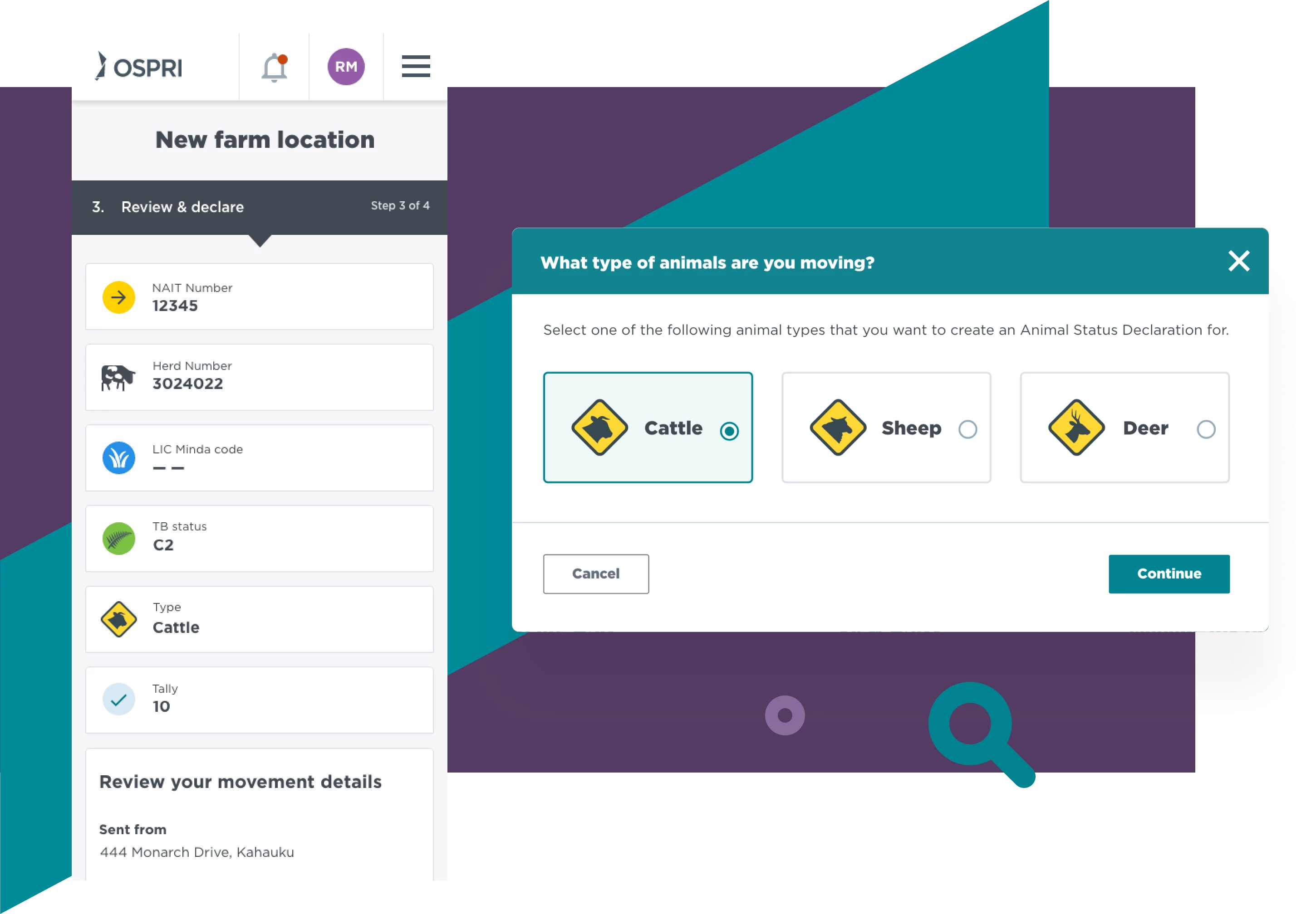
MyOSPRI features user-friendly interfaces, ensuring that farmers can seamlessly accomplish tasks while maintaining their focus on driving productivity and success in their operations.
For Farmers it represents a pivotal step forward in simplifying agricultural management – where efficiency is paramount and getting things done is made simple.

Testing makes perfect
Our team conducted testing of the proposed new website structure utilising an interactive prototype. This process involved delineating clear test objectives, devising a test script, and engaging real customers to assess the site's navigational efficacy and task completion.
What we did
Pikselin scripted and conducted interview sessions to gain important insights early with helped define the digital vision and strategy. We effectively and quickly gained key insights like goals, target audience, and approach.
We collaborated closely with stakeholders to define an initial IA draft, which served as a foundation for further refinement. Through iterative discussions and feedback, we honed the IA to ensure it effectively organized content and met the needs of both the business and users.
Tree testing is a usability technique used to evaluate the findability of topics in a website's information architecture. Participants were asked to locate specific items within a simulated hierarchy, providing insights into the effectiveness of the navigation and labelling.
We facilitated and conducted user testing interviews with participants who interacted with the website and MyOSPRI to identify any issues. The findings were compiled into a report to inform design and usability improvements.
Dynamic wireframes that blend static elements with interactive features, enriched with detailed annotations. These wireframes serve as a blueprint for web and app development, enhancing communication and clarity in design.
Crafting digital brand identities that resonate, paired with intuitive user interfaces that captivate. Our designs are not only visually compelling but also functionally accessible and responsive, incorporating iconography, infographics, and bespoke illustrations to enhance user experiences.
Utilising proven front-end development tools, we constructed the website, transforming the visual design into meticulously crafted, web-ready code optimised with the latest techniques and standards.
We utilised SilverStripe as the CMS for the website, while creating and optimising the modules, and extensions to meet specific project needs.
For MyOSPRI our devs worked with the Angular framework which was the foundation for a streamlined approach to web development. Leveraging its modular architecture, our developers were able to craft scalable and maintainable solutions that met the demands of contemporary web standards.
We tested accessibility to ensure the website is usable by people with disabilities, following standards like WCAG. The report identified any gaps and fixes needed to ensure an optimal inclusive web experience.


