Introduction
MPI knew the forestry sector lacked clear and easy access to information on forestry investment. As existing information was complex and disseminated across the sector in various websites and formats, those seeking to invest in forestry needed to engage consulting services to provide basic entry-level information.
MPI engaged Pikselin to design and develop its Canopy digital knowledge hub. We’ve produced vision, goals, web strategy, requirements, design, development, accessibility testing and support for this site.
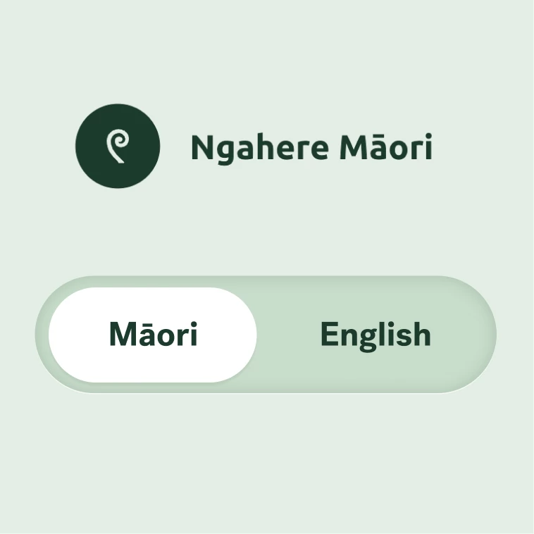
Equally expressed te reo and english
Our bilingual approach respects the equality of language between te reo and english by presenting them side by side in many places throughout the site. This design ensures that both languages are given equal prominence, enhancing accessibility and inclusivity for the target audience.
The approach also included a language button that can be toggled on any page, allowing users to switch between full-page language views. This feature ensures that users can easily access content in their preferred language, promoting inclusivity and enhancing the overall user experience.

Understanding clear goals
We needed to get user insights early for key foundational decisions. We scripted participant communications and interviews, created interview prototypes, then conducted a mix of one-on-one and focus group testing around NZ using remote video conferencing to ensure we heard from this hardto-reach audience.
We tested the brand, look and feel, and site name; usability of emerging tools; and overall comprehensibility. We analysed the results and presented our findings and recommendations to MPI.
Exploring the Forestry Lifecycle
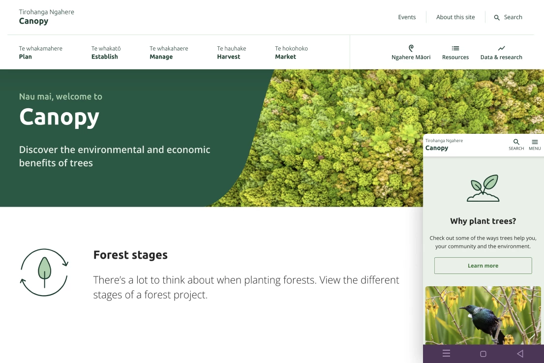
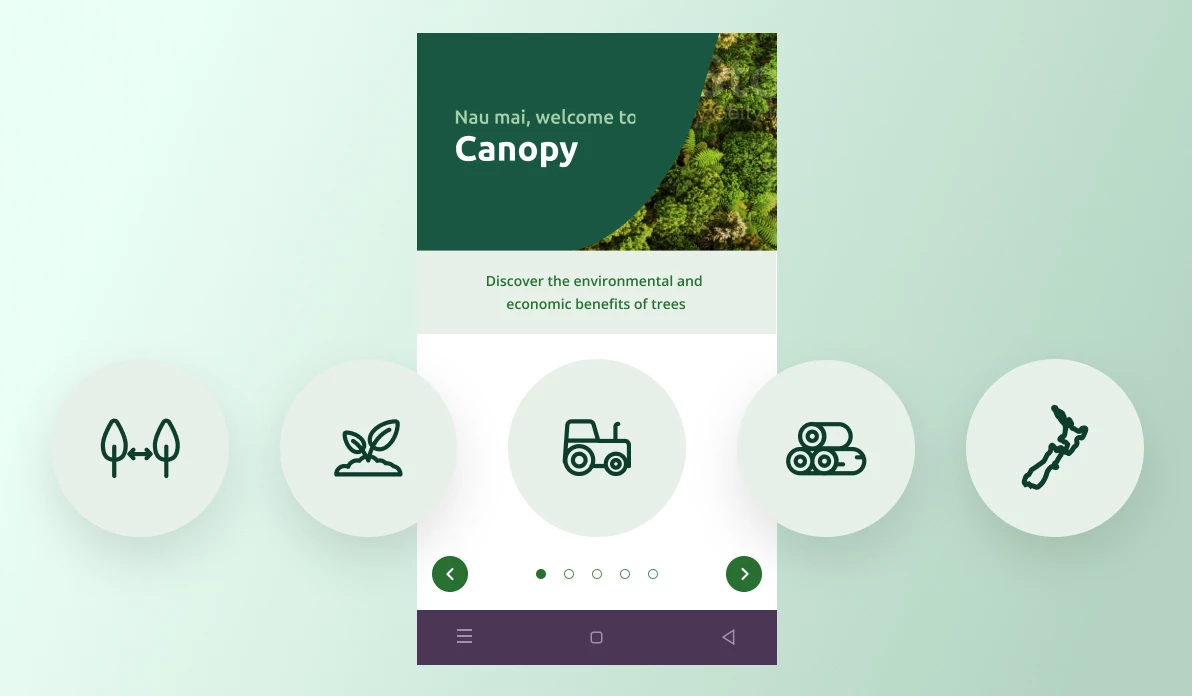
We created a range of interactive tools and visualisations to make forestry content more accessible and easier to understand, avoiding jargon to enhance the user experience.
The five step forestery lifescycle meant users could come in at any phase and see the options available to them.
Understanding the Māori view point
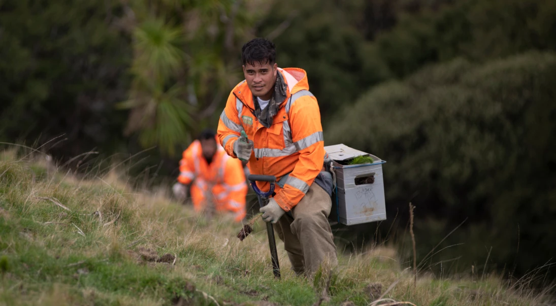
The user experience is at the core of the final product. Feedback from real users on the key initial decisions gave MPI assurance that progress had been validated by the digital knowledge hub’s intended users.
The outcomes of these user insights have helped us design and develop the site in an easily accessible format and include useful tools, data and research to support better decision making in NZ forestry.
What we did
Pikselin scripted and conducted interview sessions to gain important insights early with helped define the digital vision and strategy. We effectively and quickly gained key insights like goals, target audience, and approach.
We collaborated closely with stakeholders to define an initial IA draft, which served as a foundation for further refinement. Through iterative discussions and feedback, we honed the IA to ensure it effectively organized content and met the needs of both the business and users.
Tree testing is a usability technique used to evaluate the findability of topics in a website's information architecture. Participants were asked to locate specific items within a simulated hierarchy, providing insights into the effectiveness of the navigation and labelling.
We facilitated and conducted user testing interviews with participants who interacted with the website to identify any issues. The findings were compiled into a report to inform design and usability improvements.
Dynamic wireframes that blend static elements with interactive features, enriched with detailed annotations. These wireframes serve as a blueprint for web and app development, enhancing communication and clarity in design.
Crafting digital brand identities that resonate, paired with intuitive user interfaces that captivate. Our designs are not only visually compelling but also functionally accessible and responsive, incorporating iconography, infographics, and bespoke illustrations to enhance user experiences.
Utilising proven front-end development tools, we constructed the website, transforming the visual design into meticulously crafted, web-ready code optimised with the latest techniques and standards.
We utilised SilverStripe as the CMS and setup the database connections and site structure, while creating and optimising the modules, and extensions to meet specific project needs, like SwiftType search integration.
We tested accessibility to ensure the website is usable by people with disabilities, following standards like WCAG. The report identified any gaps and fixes needed to ensure an optimal inclusive web experience.


