Decoding tax complexity
Inland Revenue provides services to most New Zealanders over the course of their careers and personal lives. Its website had evolved organically over a long period resulting in hundreds of different templates using countless combinations of brand and style elements. Customers often left the site confused and in need of further information or reassurance of task completion.
Pikselin were tasked with driving design for this long overdue refresh, resulting in our involvement in project methodology and planning, technical consultation, discovery and analysis activities, user research, conceptual and detailed design.
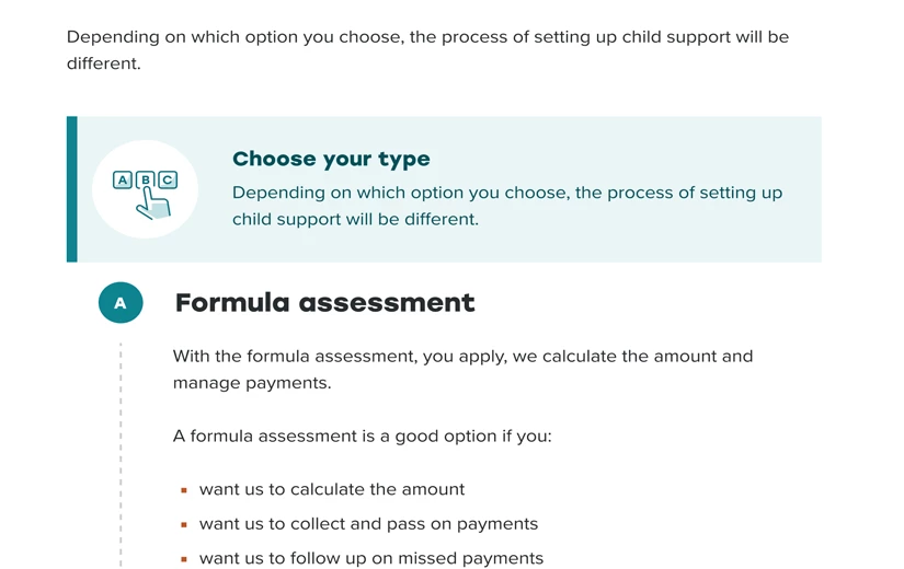
Digital presence overhaul
The Web Rebuild Project was embarked on late 2017-2018. The project carried out an extensive discovery process that included engaging various stakeholders and reviewing existing documentation, during which it was learned that the Inland Revenue’s digital design direction has evolved organically from its print identity and was no longer fit for purpose for its multitude of digital assets.
A variety of interpretations of the brand and style guidelines exists on IR’s digital platforms and more continue to be created as IR intensified its delivery of self-service products. Inland Revenue had reviewed it's brand and style guidelines and is broadly happy with these for most purposes except digital. It was clear that the current brand guideline did not cater to the necessary specifics of digital branding such as accessible typefaces and colourways.
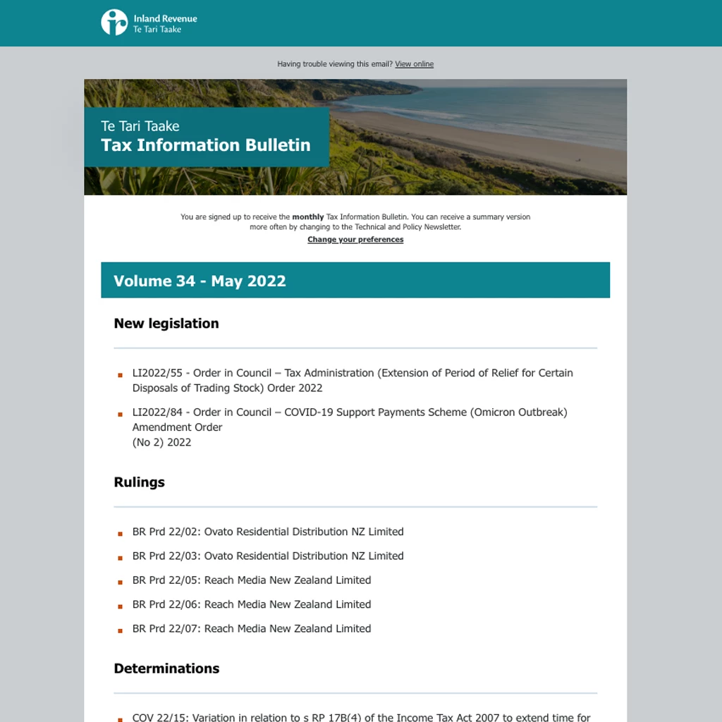

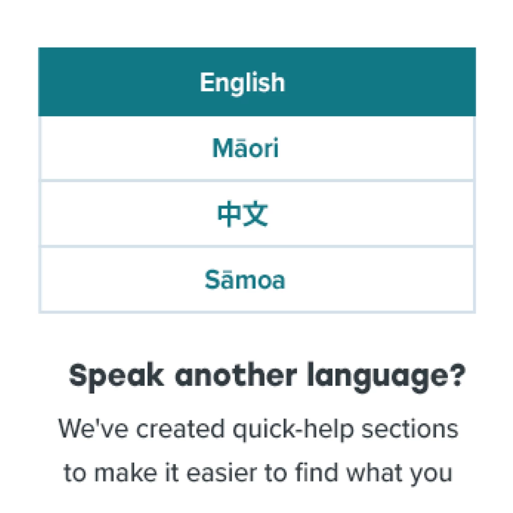
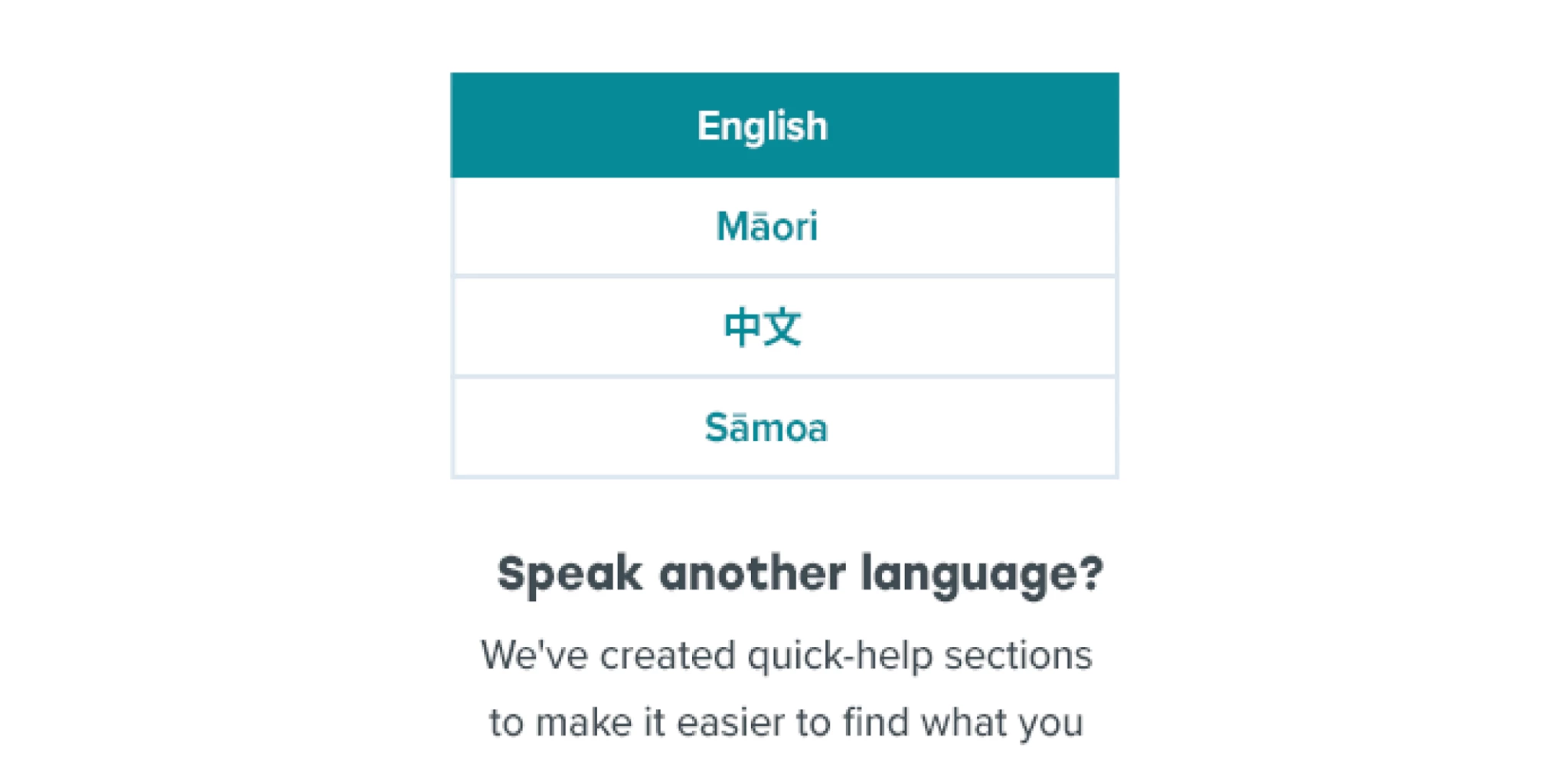
Supporting users with visual aids
The Inland Revenue website must be accessible to all New Zealanders and meet the needs of those who have disabilities, low literacy, and limited English language comprehension. To break up written content and create an engaging and intuitive user experience, Pikselin conceptualised a range of interactions that incorporate icons, diagrams, tables and step-by-step processes.
Brand guidelines
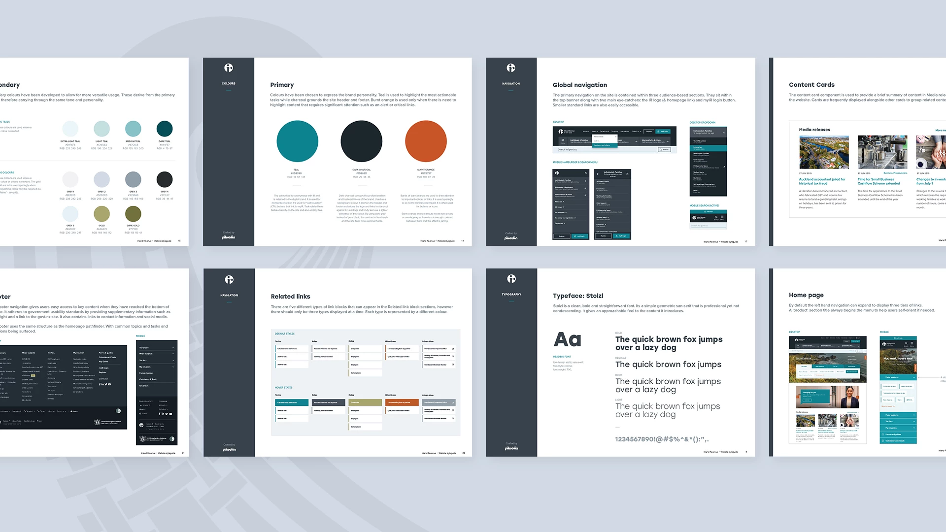
As part of the branding exercise, we extended the IR brand guidelines to create a fresh look and feel for websites. It was user tested with select audience groups to fine tune and land on a design direction that the stakeholders were satisfied with. Pikselin continues to build on the designs that have been implemented till date and extend the visual design to other related products such as the Tax Technical and Tax Policy websites.

Full accessibility review
We conducted a comprehensive accessibility review of the IR websites, evaluating its compliance with the NZ Government’s Web Accessibility Standard and W3C’s Web Content Accessibility Guidelines (WCAG).
We tested for compatibility with screen readers, keyboard navigation, and other assistive technologies to ensure the site is accessible to users with disabilities. The review identified key areas for improvement, and we have provided detailed recommendations to enhance the website's overall accessibility and user experience.
Tax products for professionals
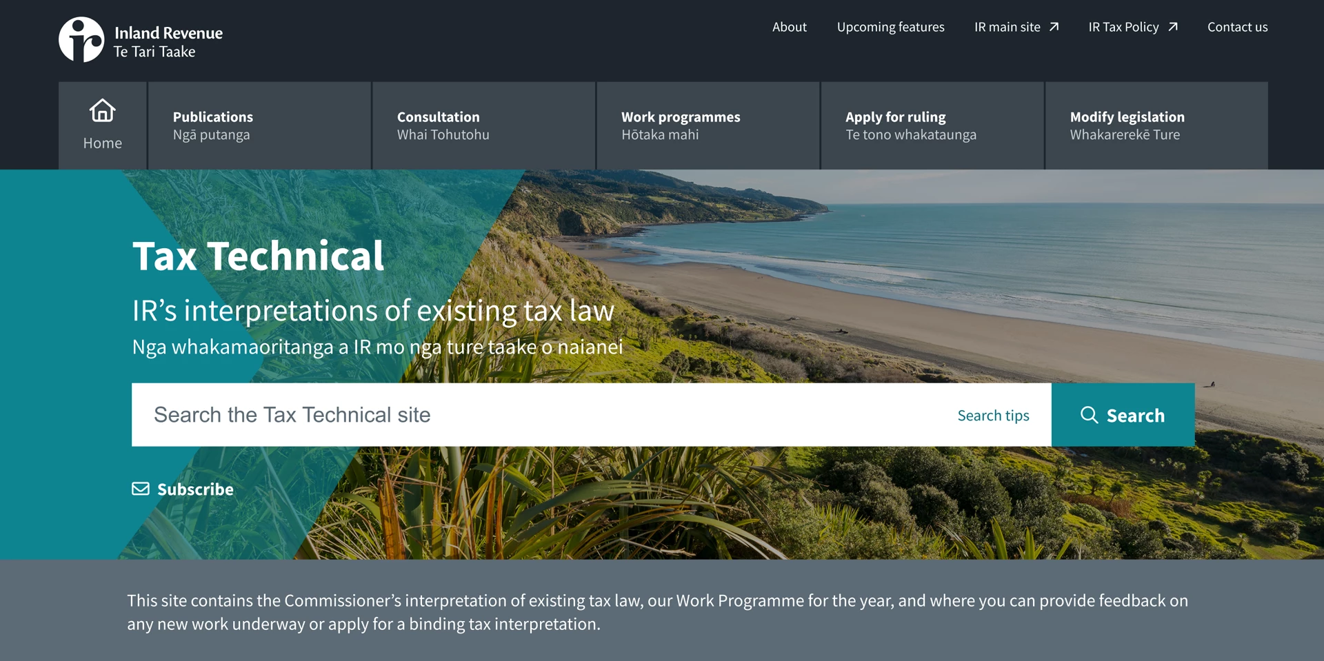
The Inland Revenue Tax Technical and Tax Policy websites offer comprehensive resources on tax-related matters. The Tax Technical website provides the Commissioner’s interpretations of existing tax laws, outlines the annual Work Programme, and allows users to give feedback on new initiatives or apply for binding tax interpretations.
The Tax Policy website features the latest updates on tax policy, including announcements, publications, and details on tax-related bills. It also contains information on international tax treaties, such as double tax agreements and exchange agreements.
What we did
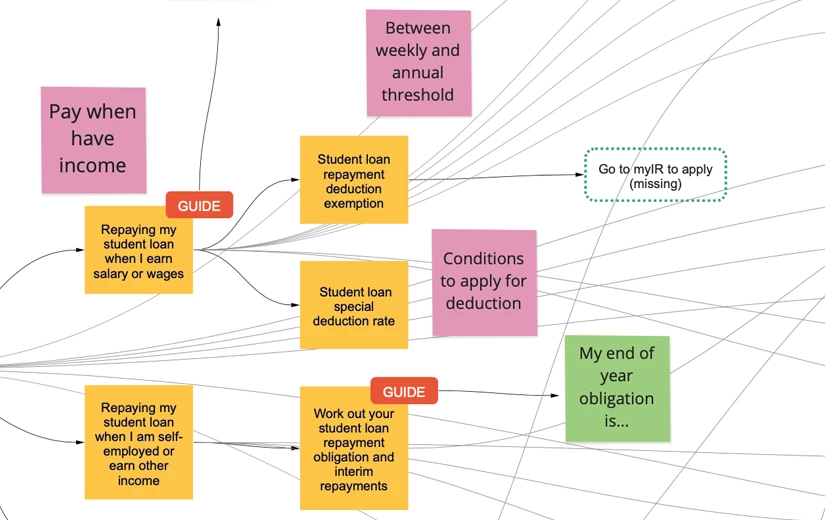
We collaborated closely with stakeholders to define an initial IA draft, which served as a foundation for further refinement. Through iterative discussions and feedback, we honed the IA to ensure it effectively organized content and met the needs of both the business and users.
We facilitated and conducted user testing interviews with participants who interacted with the website to identify any issues. The findings were compiled into a report to inform design and usability improvements.
Pikselin scripted and conducted interview sessions to gain important insights early with helped define the digital vision and strategy. We effectively and quickly gained key insights like goals, target audience, and approach.
Crafting digital brand identities that resonate, paired with intuitive user interfaces that captivate. Our designs are not only visually compelling but also functionally accessible and responsive, incorporating iconography, infographics, and bespoke illustrations to enhance user experiences.
Interactive prototyping is at the heart of our design process, allowing us to bring concepts to life and refine them through user feedback. By creating interactive models of our designs early in the development cycle, we ensure that functionality and user experience are thoroughly tested and optimised. This iterative approach not only accelerates innovation but also ensures that our final products meet user needs effectively.


