Introduction
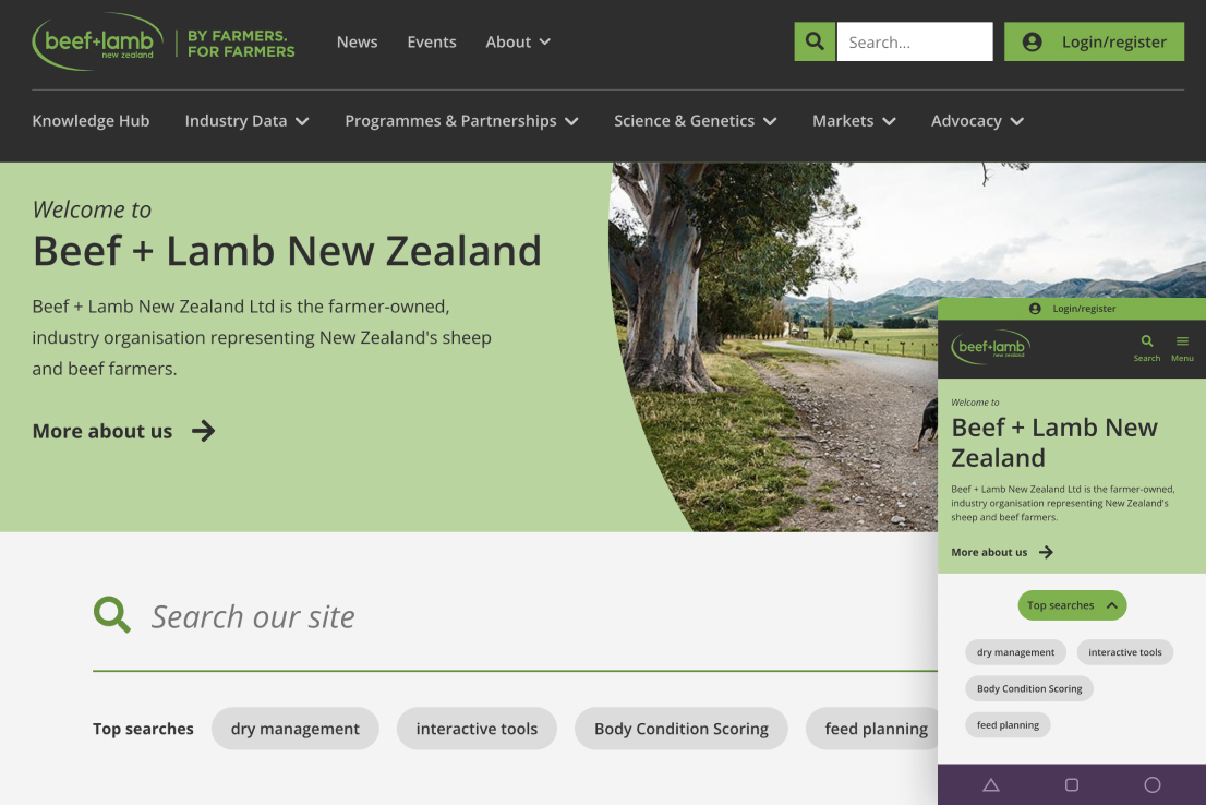
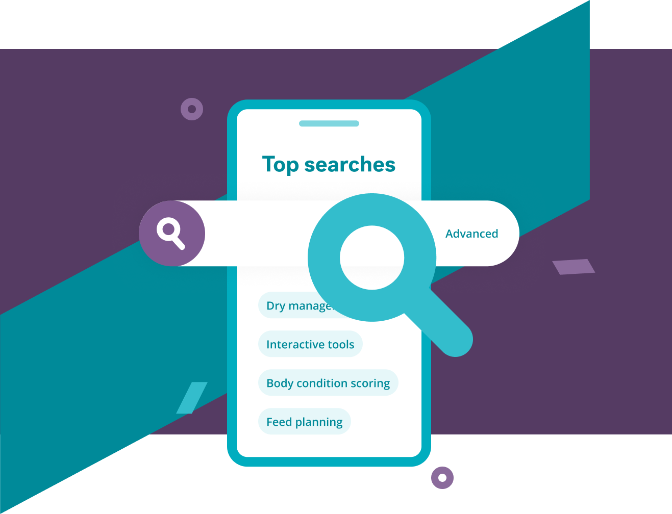
The premier farmer-owned industry organisation dedicated to championing the interests of New Zealand's sheep and beef farmers. Previously, the website housed a wealth of invaluable information, yet accessing it proved challenging due to complex navigation structures. In collaboration with B+LNZ, we've helped upgrade the website and introduced a simplified navigation system, implemented an intuitive, and an easy-to-use categorised search.
With a clean, responsive interface, a refined, intuitive, filterable search, and a greater focus on highlighting information that best fulfils the needs of the target audience, we provided a website that offers the greatest benefit for our client (and their users) both now and moving into the future.
Discovery to design
We worked with B+LNZ to come up with a flatter, simplified navigation system and implemented an easy-to-use, categorised search. Both of these put more emphasis on the content they were trying to surface to their target audience, namely the many useful articles, tutorials and other information contained within the new Knowledge Hub.
This enabled us to understand the use and needs of the users and agency alike – navigation and content. Thus, the design decisions made were appropriate to what the real needs of the audience were. On top of this we refreshed the brand experience with a modern and inviting look and feel, tailored to resonate with the New Zealand farming community.
The knowledge hub
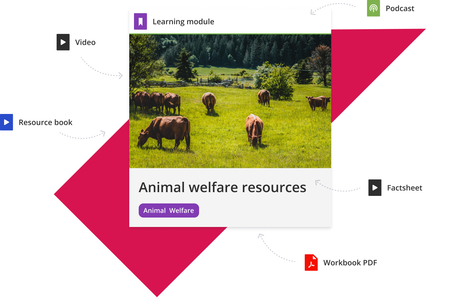
We created a searchable and categorised collection of content in a variety of formats (PDFs, multimedia presentations, video, podcasts, and standard webpages) to help farmers maximise their growing and business potential.
Keeping farmers happy
After the initial launch in late 2017, Pikselin developed an improved IA and design refresh in late 2023. Developed using Drupal CMS (and hosted on the cloud-based Pantheon platform), along with a clean, responsive interface, a refined, intuitive, filterable search, and a greater focus on highlighting information that best fulfils the needs of the target audience.
We provided a website that offers the greatest benefit for the client (and their users) both now and moving into the future.
The action network
With the help of the Red Meat Profit Partnership (RMPP), we developed an online planning tool that allowed farmers to create groups that could apply for funding to pursue various research topics. Integrated with RMPP's own CRM system, this allowed for a smooth and user-friendly way for farmers to put together a funding proposal with the minimum of fuss.

What we did
We collaborated closely with stakeholders to define an initial IA draft, which served as a foundation for further refinement. Through iterative discussions and feedback, we honed the IA to ensure it effectively organized content and met the needs of both the business and users.
Tree testing is a usability technique used to evaluate the findability of topics in a website's information architecture. Participants were asked to locate specific items within a simulated hierarchy, providing insights into the effectiveness of the navigation and labelling.
We facilitated and conducted user testing interviews with participants who interacted with the website to identify any issues. The findings were compiled into a report to inform design and usability improvements.
Dynamic wireframes that blend static elements with interactive features, enriched with detailed annotations. These wireframes serve as a blueprint for web and app development, enhancing communication and clarity in design.
Crafting digital brand identities that resonate, paired with intuitive user interfaces that captivate. Our designs are not only visually compelling but also functionally accessible and responsive, incorporating iconography, infographics, and bespoke illustrations to enhance user experiences.
Utilising proven front-end development tools, we constructed the website, transforming the visual design into meticulously crafted, web-ready code optimised with the latest techniques and standards.
We employed Drupal as the CMS, establishing database connections and structuring the site, all while crafting and optimising modules and extensions to precisely align with the project's requirements.
We tested accessibility to ensure the website is usable by people with disabilities, following standards like WCAG. The report identified any gaps and fixes needed to ensure an optimal inclusive web experience.


